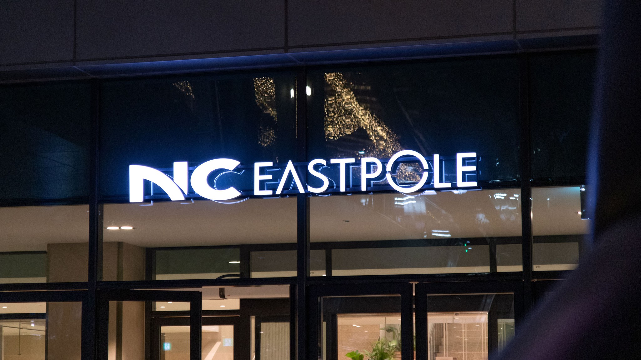

NC EASTPOLE Wayfinding System
Client
넥스트커넥트PFV
Role
Spatial Development
Date
2024
단절이 아닌, 연결과 소통을 위한 상업공간
이스트폴이 들어선 구의역 일대는 2호선 라인의 성수·건대, 혹은 잠실 상권에 비해 상대적으로 주목도가 낮은 주거지 중심 지역이었습니다. 광진구청, 주거, 고급 호텔을 아우르는 복합시설의 등장은 분명 기대감을 만들었지만, 한편으로는 주변의 개성 강한 상권과 비교되며 규모에 비해 주목받지 못할 가능성도 존재했죠. 게다가 이스트폴이 들어선 당시, 서울에는 백화점을 제외하더라도 대형 쇼핑몰이 이미 60여 곳을 넘어서는 상황이었습니다. 우리는 이스트폴의 사이니지와 특화시설 프로젝트를 통해, 단순히 길을 안내하고 ‘기억에 남는 장소’를 만드는 수준을 넘어, 상업공간이 지향해야 할 새로운 공간 문법을 제안하고자 했습니다. 과거의 상업공간은 사람을 ‘끌어들여 머무르게 하는 것’이 성공의 기준이었습니다. 체류 시간이 길수록 소비가 늘어날 것이라는 단순한 논리 때문이었죠. 그러나 우리가 주목한 오늘의 공간은 달랐습니다. 주거와 상업, 문화와 공공성 사이의 경계를 단절시키기보다, 유기적인 연결을 통해 장소성을 확장하고 새로운 탐색을 가능하게 했습니다. 이에 우리는 안과 밖이 교차하는 경계의 개념을 강화하고, 공간 전체를 하나의 흐름으로 잇는 웨이파인딩 시스템으로서의 사이니지를 개발했습니다. 동시에, 이러한 연결이 실제로 체감될 수 있도록 구심점 역할을 하는 지점들을 선별해, 사람과 동선이 만나는 특화 공간으로 제안했습니다.
Ko
Eng
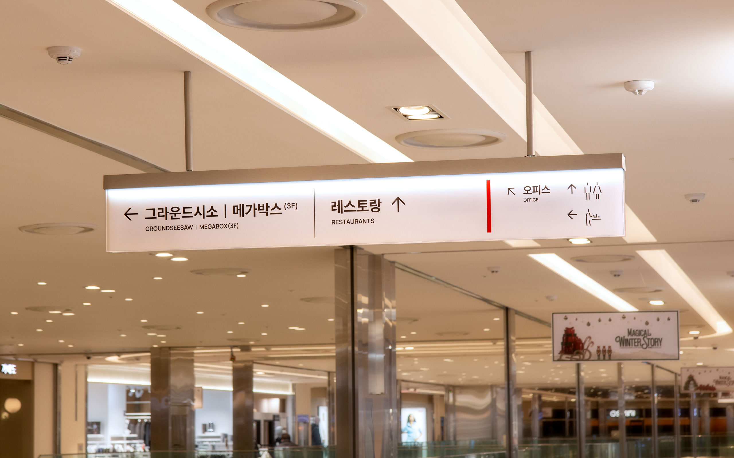
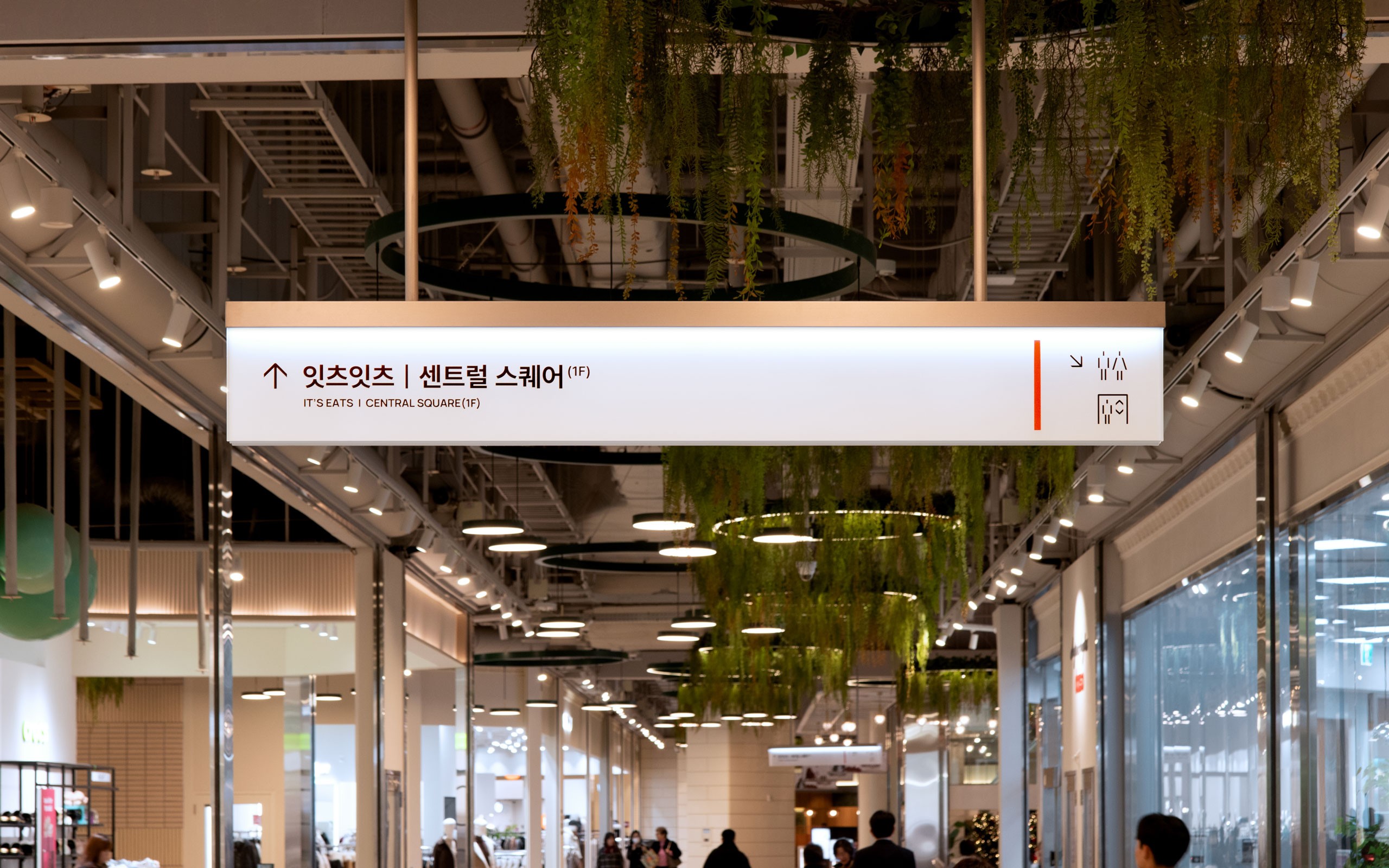
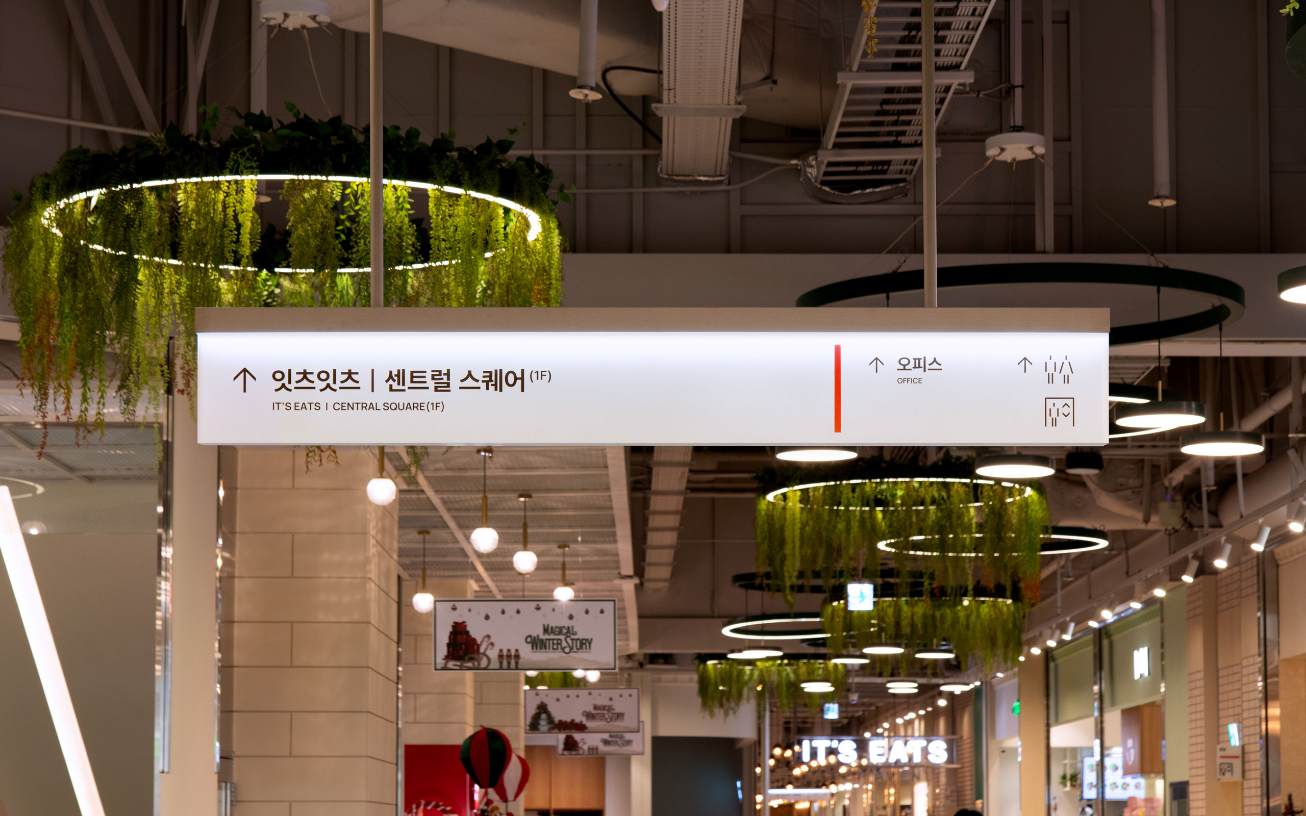
The primary purpose in EASTPOLE's signage design was to reveal its spatial characteristics. Unlike typical shopping malls that use enclosed structures to draw people inside, EASTPOLE functions as a passage connecting residences, cultural facilities, offices, public services, and the subway, while also acting as a central hub. We reinterpreted this role as a flow that traverses diverse scenes of life and unifies them.
Through layered transparent materials and visually impactful colors, we aimed to define information hierarchies while creating an image of permeating light and continuously flowing color, offering both a sensory impression and spatial continuity.
이스트폴의 사이니지 디자인의 주요 목적은 그 공간적 특성을 드러내는 것이었습니다. 일반 쇼핑몰이 사람들을 내부로 유도하기 위해 폐쇄적인 구조를 사용하는 것과 달리, 이스트폴은 주거, 문화시설, 오피스, 공공서비스, 지하철을 잇는 통로이자 중심 허브로 기능합니다. 저희는 이러한 역할을 다양한 삶의 장면을 관통하며 하나로 묶는 '흐름'으로 재해석했습니다.
투명한 소재의 레이어와 시각적 임팩트를 주는 색을 활용하여 정보 위계를 명확히 하면서도, 빛이 스며들고 색이 지속적으로 흐르는 이미지를 구현해 감각적 인상과 공간적 연속성을 동시에 전달하고자 했습니다.
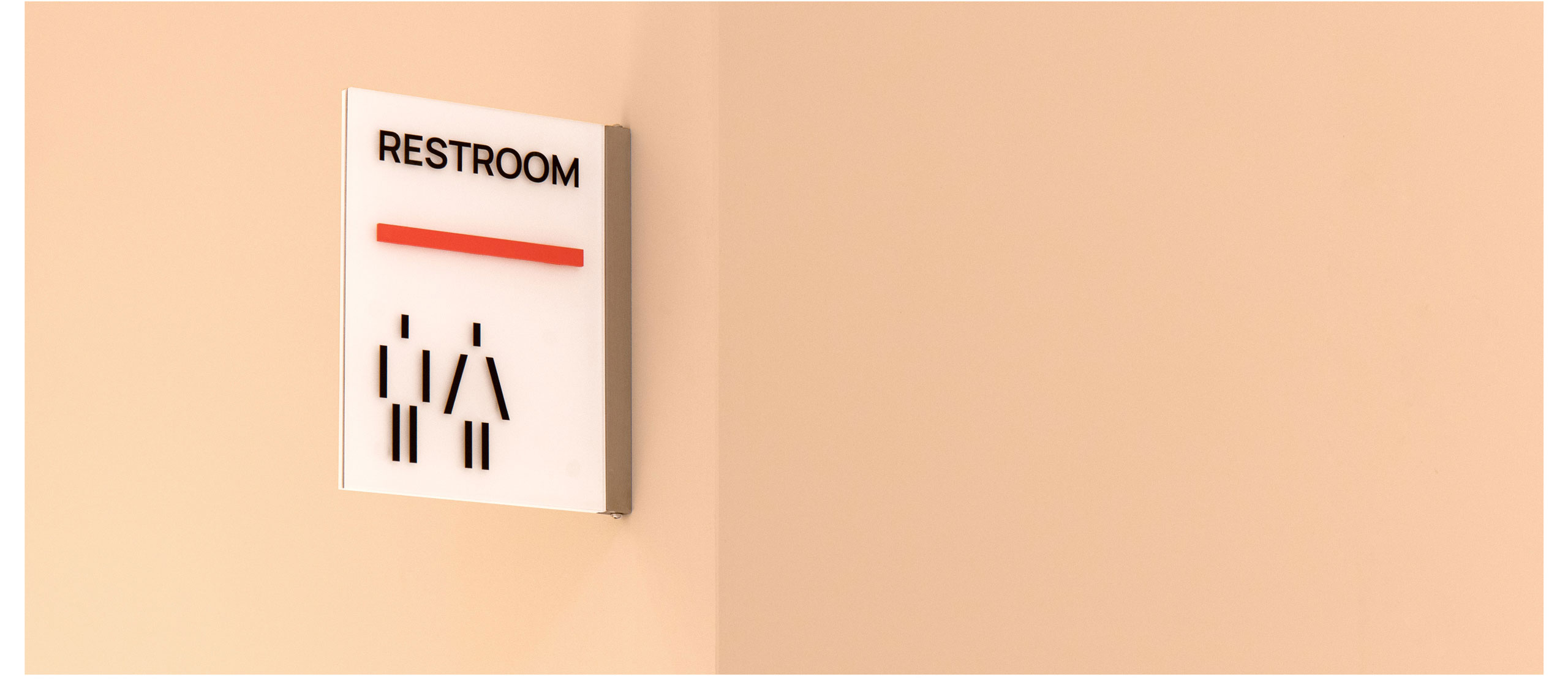
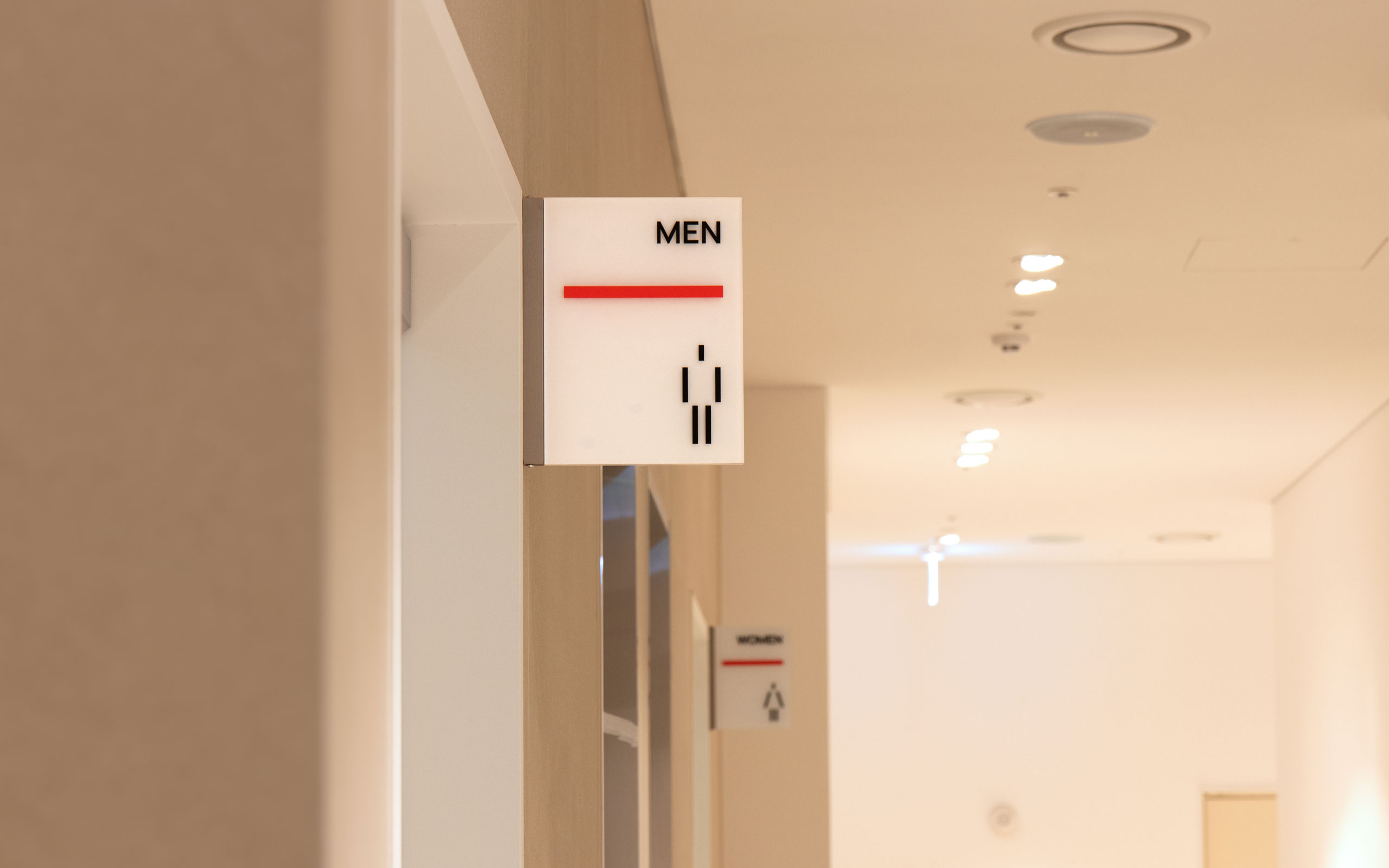
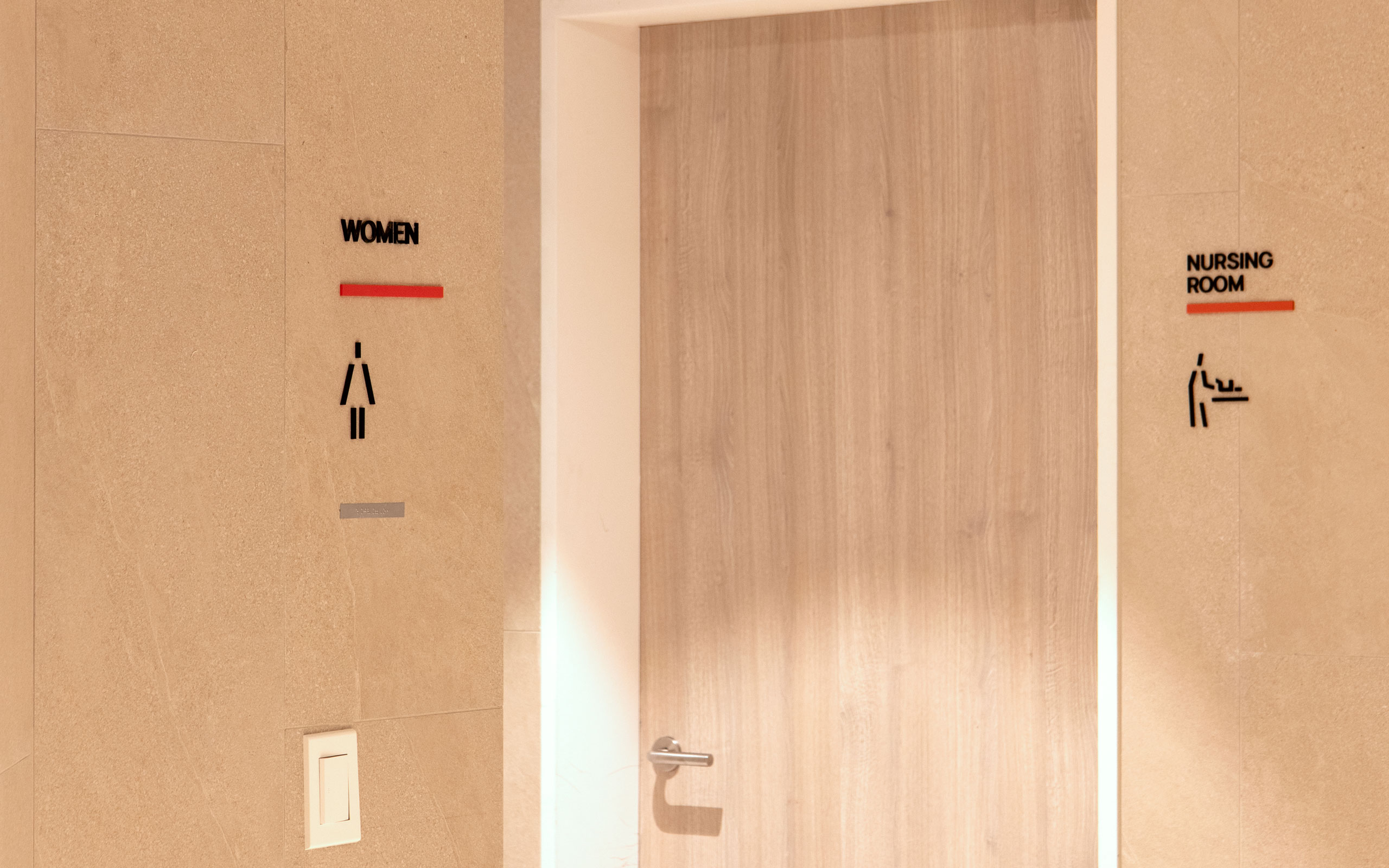
The pictograms within the wayfinding system were designed to incorporate simple linear forms whenever possible, harmonizing with the linear elements inherent in the concept of light penetration and connection that traverses the space. Where necessary, they were linked with curves to form a unified visual system.
웨이파인딩 체계 내의 픽토그램은 공간을 관통하는 컨셉인 '빛의 관통과 연결'이 지닌 직선적 요소들과 어우러질 수 있도록 간결한 직선의 형태를 가급적 차용하되, 필요한 경우 곡선과 연계하여 하나의 시각적 체계를 이룰 수 있도록 설계하였습니다.
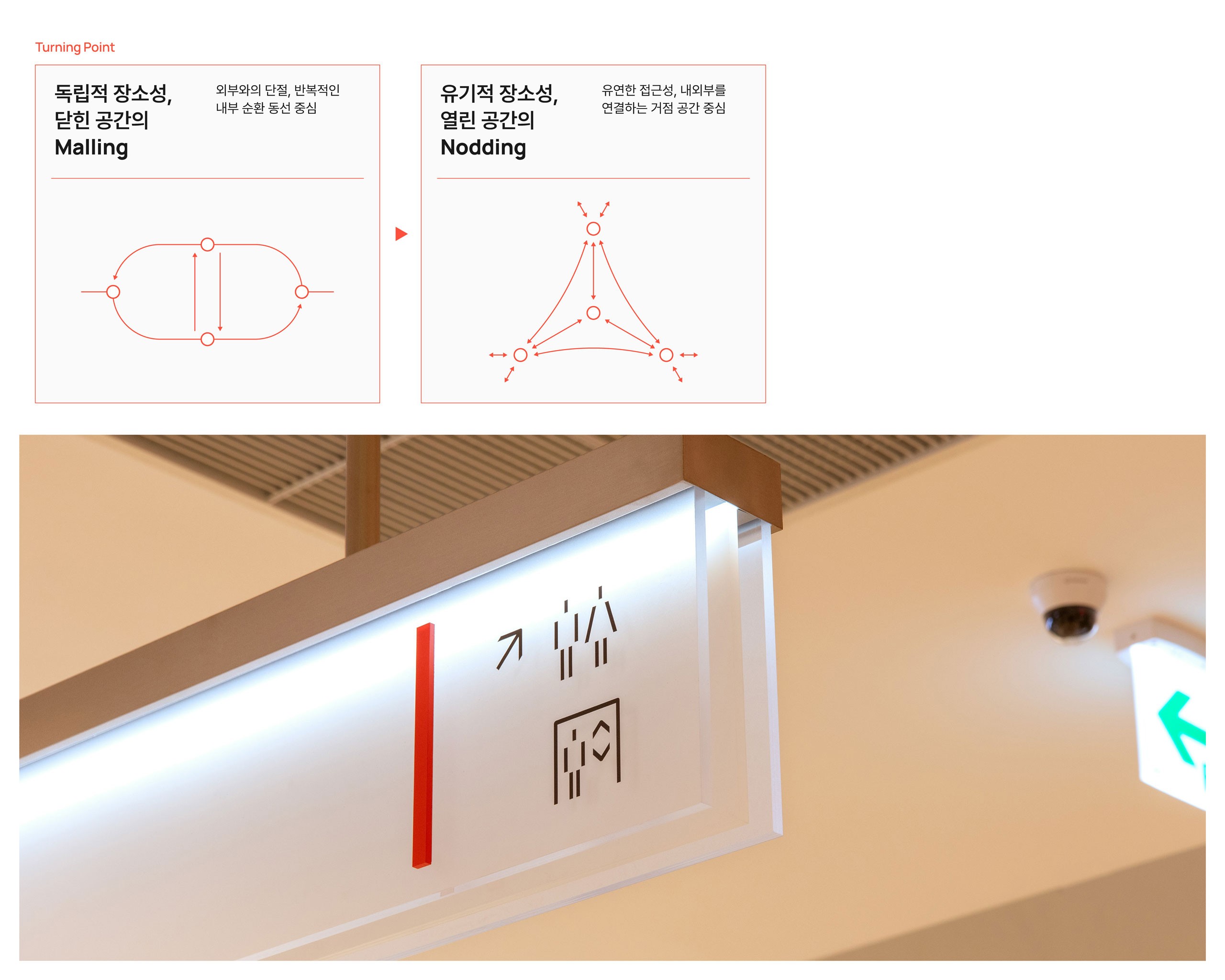
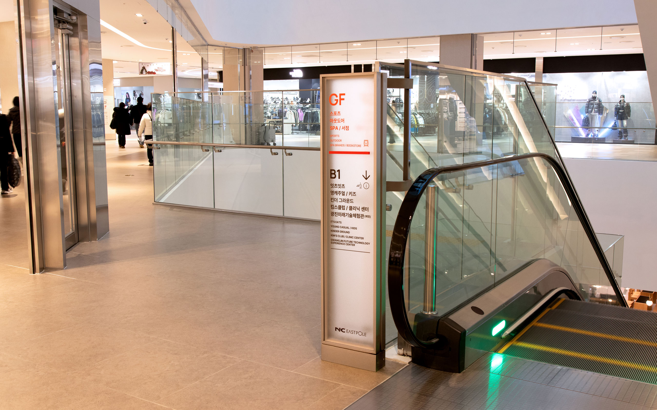
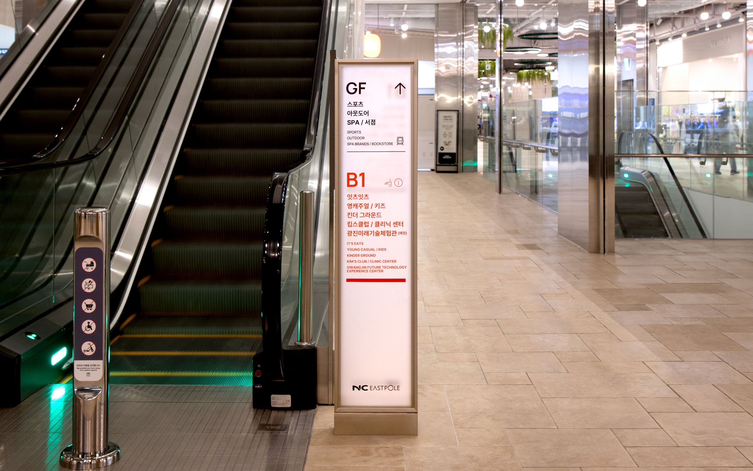
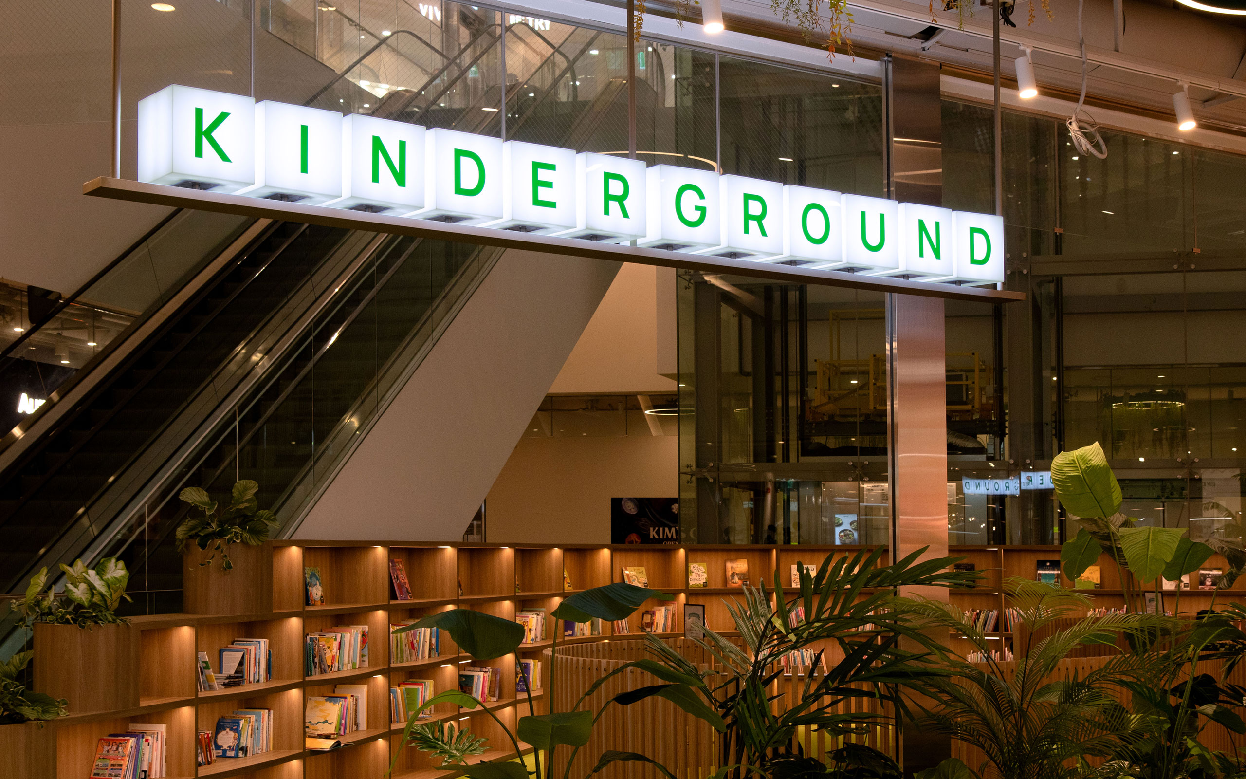
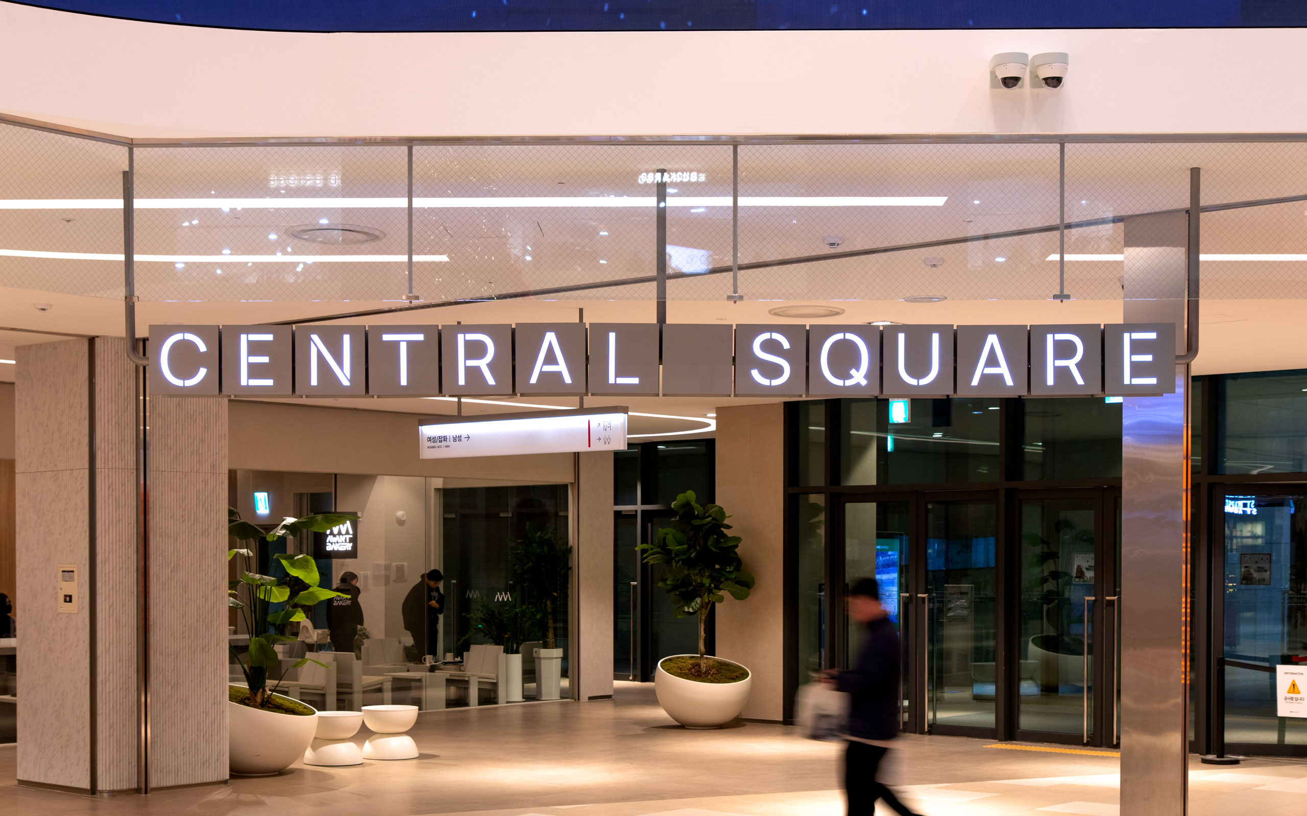
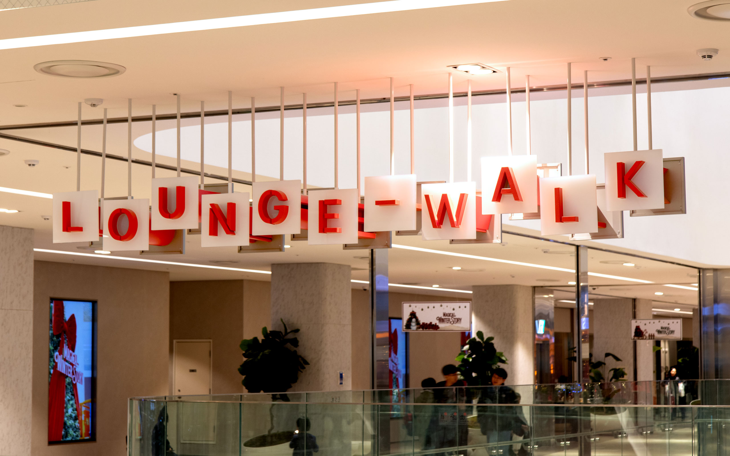
The purpose of the specialized spaces at EASTPOLE was twofold: to address the risk of being overlooked as a mere passageway between facilities and to create memorable destinations within the commercial area. In today's environment shaped by SNS and digital marketing, creating memorable core spaces was essential. To this end, we designated walkways, media facades, F&B, and kids' spaces to provide distinct placeness and motivate visits. While retaining the design concepts of three-dimensionality and transparency, we developed signage that expressed each space's unique characteristics.
특화공간이 이스트폴에 갖는 목적성은 크게 두 가지였습니다. 여러 시설 사이에 끼인 공간적 특성으로 인해 경로처럼 그냥 지나치기 쉽다는 단점을 극복하고, 상업공간 내에 목적지로 기억될 만한 곳들을 만들어 주는 것이었습니다. SNS와 디지털 마케팅이 주를 이루는 현재의 환경 속에서 기억에 남을 만한 핵심 공간을 만드는 것 또한 중요했습니다. 이를 위해 공간 속에서 독립된 장소성과 방문의 동기를 제공하는 보행로, 미디어 파사드, F&B 와 키즈 공간을 지정하고, 이 공간들에 기존 디자인 컨셉인 입체감과 투과의 개념을 유지하면서, 각 공간의 특성을 반영할 수 있는 사이니지를 제작하였습니다.
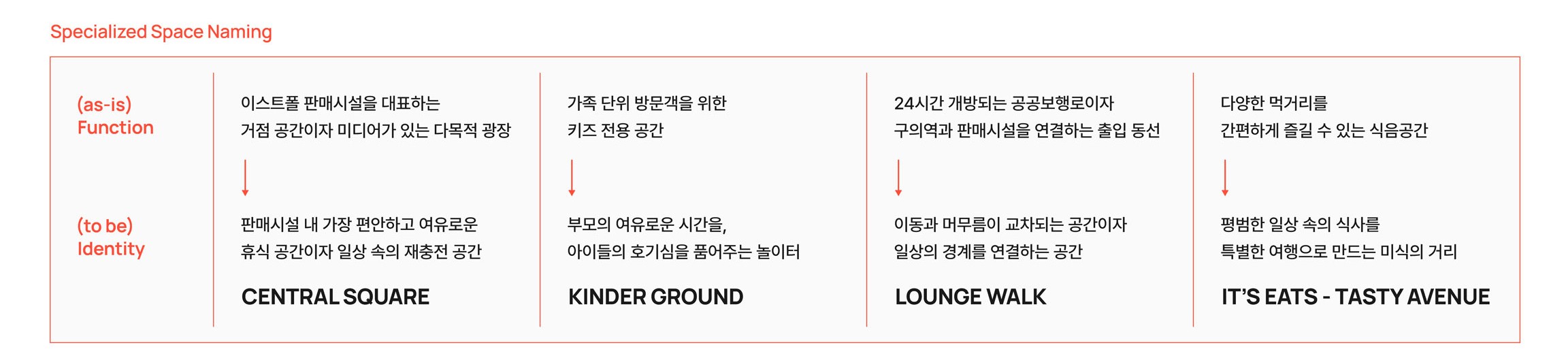
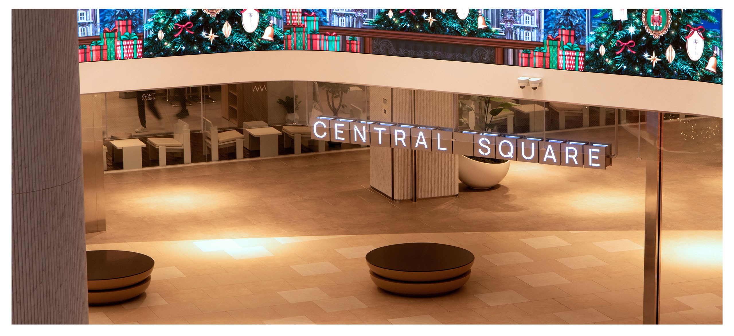
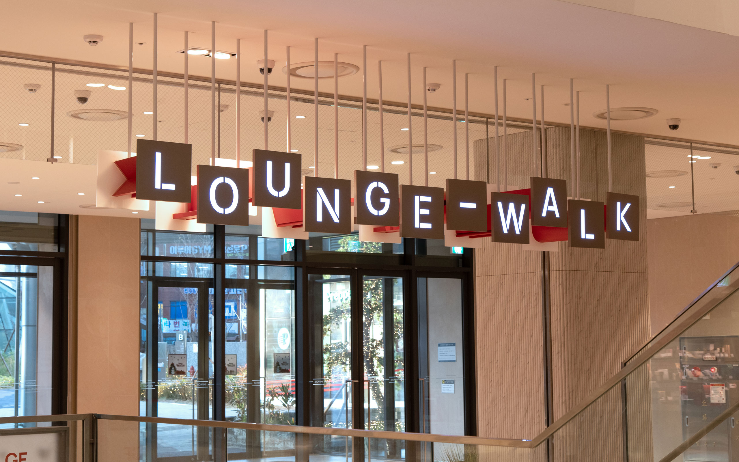
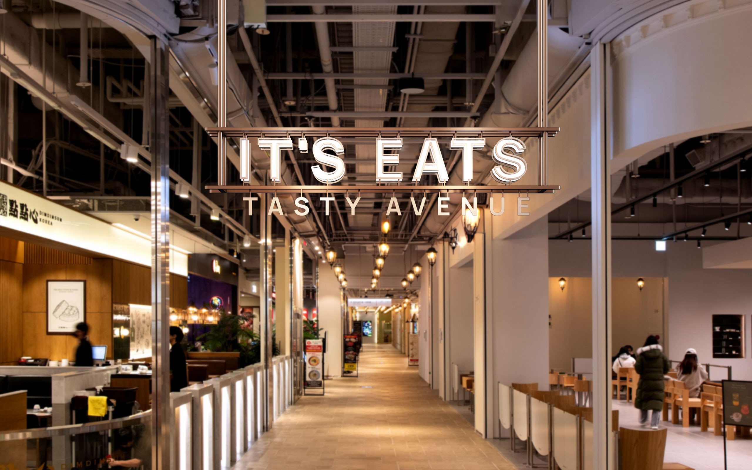
특별하게 느껴지는 공간은, 기능적 차별성 보다도 경험하는 맥락과 방식의 차이로 완성됩니다.
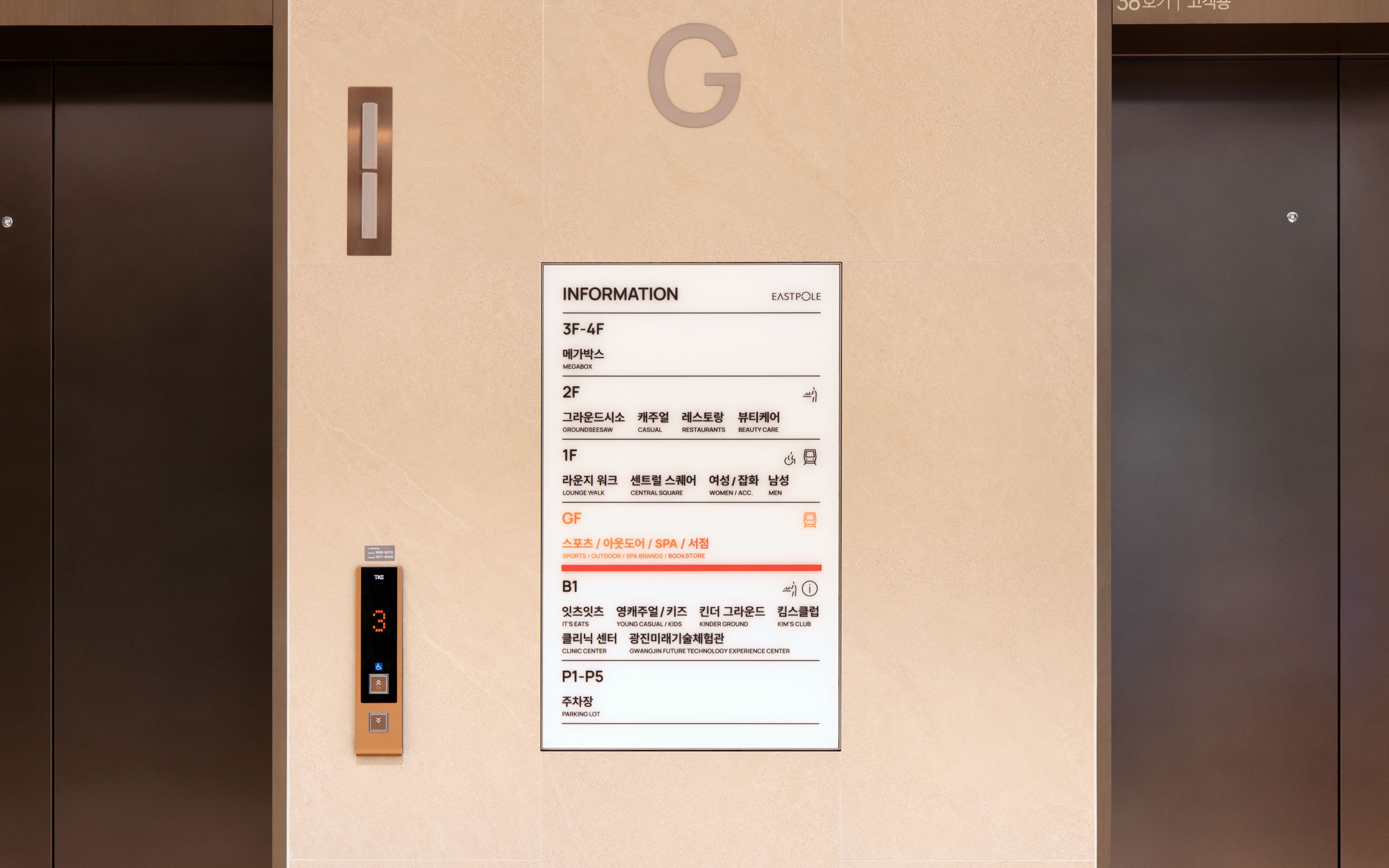
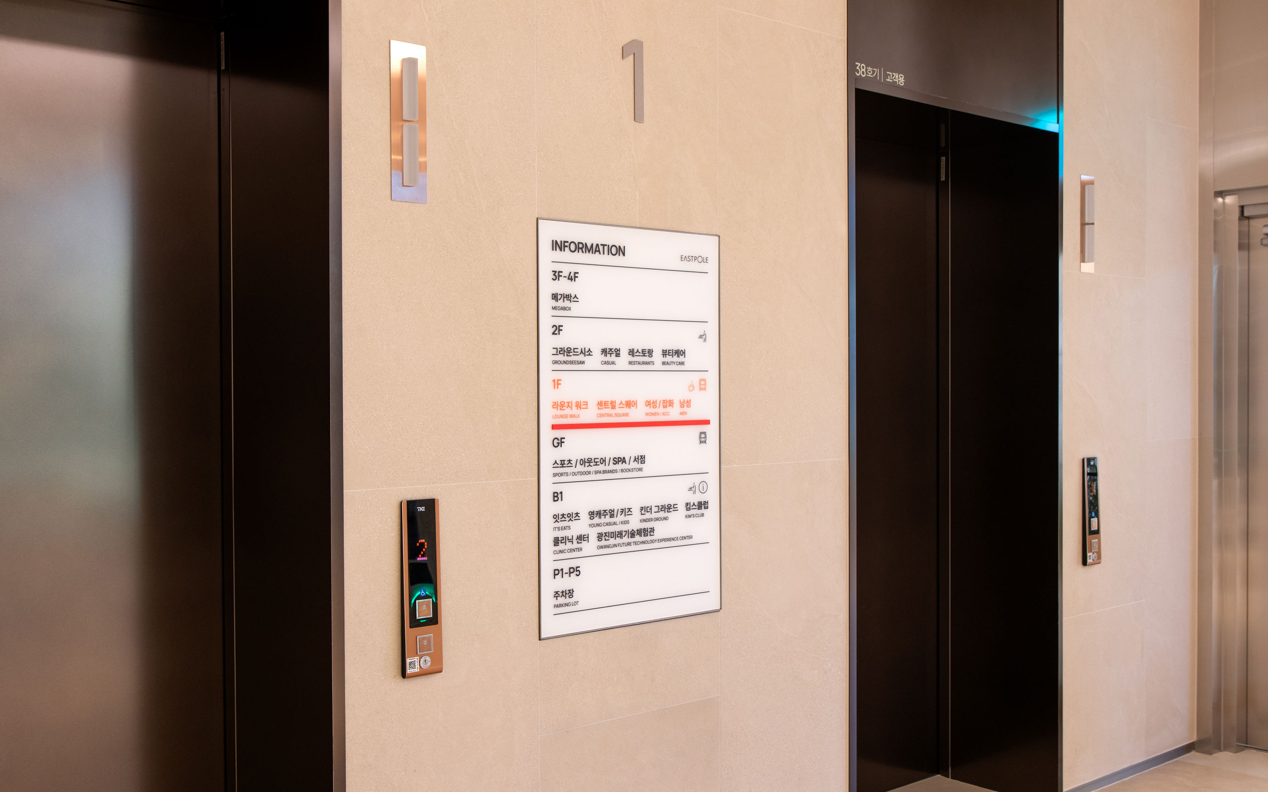
우리는 잠재 고객의 관점에서 이스트폴 내 4개의 핵심 노드를 설정하고 각 노드의 개념과 명칭을 개발했습니다.
각 노드는 이스트폴을 대표하는 공간으로써, 이 노드들을 통해 전체 시설의 위치와 관계를 보다 뚜렷하게 인지하고
해석할 수 있도록 웨이파인딩 시스템과 방향 정보의 축으로 설정했습니다.
Executive Director
배지훈
Creative Director
박상진
Conceptor
송주리
Designer
한승민, 강성혁, 윤현동, 이건희, 강승희
Motion Graphic
윤현동
Photography
윤현동